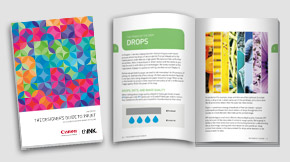
Rethinking Direct Mail Design in the Era of Inkjet
Today, much of the direct mail marketing that crosses our doorstep was designed for offset printing, even if executed on an inkjet device. Most designers understand the capabilities of offset printing and create their designs to take advantage of offset features, including the ability to control the tone of blacks and ink saturation. They understand finishing options, the role of bleeds, and for direct mail, how to ensure something is mailable. The designs they create are often rooted in what they know an offset press can produce, so some guidance is certainly in order in this brave new world of inkjet!
Inkjet is digital technology, you can create regionalized, localized, customized, and even personalized direct mail.
Consider how the offset printing process allows for monochrome, spot color, process color, and extended gamut process color printing. A designer might specify color in Pantone Matching System (PMS) numbers or by a name. They might want a pastel pink or a brand-specific red. Designers who understand offset print production often set inking limits in the design files and may even specify these limits within the graphic resource files. The resulting files push the limitations of ink very high to achieve that rich, luxurious look often associated with offset printing.

Designers regularly use rich black—the combination of cyan, magenta, and yellow with black—to produce a neutral black tone. This tends to produce a darker, more optically dense black than process black (K = 100), but most designers know enough to take care when specifying rich black for typography. For rich black type, some designers will specify one color, such as magenta or cyan, as the base color at 100 percent and then fill in with the other two colors to make the black they want.
Rich black can be created using a wide array of formulas, and adding all of those percentages together can mean a lot of ink on the page. Most offset print environments have workflows to handle saturated print and have built processes to account for drying time before finishing. In the fast-paced world of inkjet, the goal is to produce print that is dry as it exits the press. Many offset-prepared files, with and without rich black components, come to a digital inkjet environment and run perfectly because the digital front end (DFE) and color profiling work together to optimize the final print. With some guidance, however, designers can prepare files that are inkjet friendly from the start to ensure optimal print speeds, ink usage, and suitability for finishing.
Design Elements to Watch

Designers may attach ICC profiles to their work to control color values based on what they are seeing on their monitors. Those ICC profiles may be attached to the file or to specific elements within the file, such as a particular photo or graphic. It is worth taking the time to look for ink limits set above 100 percent and color formulas that add up to more than 100 percent. The DFE on most presses today can handle the file, but you may find that when you print, some pieces use more ink than they should need. For crisp direct mail design, dialing back the ink limits will generally produce the best results.
Watch for the resolution of images. Images developed for online use (72 dpi, 96 dpi) pose a challenge, but images with extremely high resolution (2,500 dpi) can do so as well. These high-resolution images make the files larger, which means that they take more time to process. The best results come from images tuned to 600 dpi or 1,200 dpi since they provide enough data for the press to produce sharp images without slowing things down too much.
It’s also important to consider bleeds and how they will print in the inkjet environment. Print does not extend to the edge of the paper in most cases, so designs may need to be tuned to account for the bleed within the printable area on the substrate. In addition, consider the finishing equipment available for digital production to ensure it can produce clean cuts through bleeds. Finally, bear in mind as you are developing the design that unlike toner, there is some dot gain in inkjet printing.

Direct mail is at its best when text, image, and design elements are sharp and vibrant. Attentive image selection and graphic design provide the best infrastructure to the marketing message. Seek images with good contrast?—muddy midtones and deep shadows tend to use more ink and mask image content. Also, look at the fonts. Embed all fonts into the file to ensure what you design is what you will get.
Don’t discount the importance of data-driven techniques!
Remember that inkjet is digital technology, so you can create direct mail marketing campaigns that are regionalized, localized, customized, and even personalized. Sending direct mail that doesn’t take advantage of simple data points?—?time of year, community events?—?overlooks the biggest advantage of the technology. Today’s direct mail communications should include images and messages relevant to the recipient. Although this may sound daunting, it doesn’t have to be. Start with where your recipients live and pay attention to the seasons?—?if you can discern age group and gender, leverage that information as well. Access to buying profiles can also be very helpful. Whatever you do, don’t discount the importance of data-driven techniques! Simple things like adding a map to a store location or office, using photos from a region or neighborhood, and acknowledging age differences can go a long way in engaging today’s direct mail recipients.
WATCH THE VIDEO